


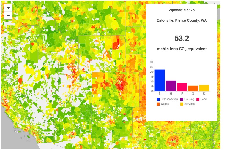
Keep an eye on your area’s carbon consumption and compare it to the rest of the country with these new interactive maps from UC Berkeley. Linked to their CoolClimate Carbon Footprint Calculator, this new tool visualizes the nation’s carbon consumption in a fresh way and invites new comparisons–pit the East Coast against the West, mountains again valleys or cities against suburbs. Additional maps break down carbon usage into household energy and transportation.
View this complete post...
 RSS Feed