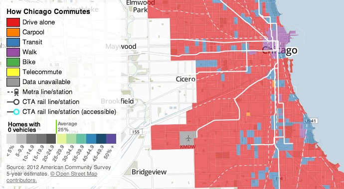
A unique interactive map from Transitized illustrates the various modes of transportation used by Chicagoans in their daily commutes.
You’ll see a lot of red on the map, symbolizing the carbon-conscious citizen’s nightmare of “driving alone,” but the outlook’s not all so bleak–most downtown neighborhoods favor walking, and some transit corridors with direct access to downtown (though not all, strangely) bring a majority of residents to work. Biking and carpooling are all but invisible at first, but mouseover any area of the map and you’ll see quick stats for that exact spot, revealing that lesser-utilized modes of transportation are still present in significant–if not majority–numbers. View the full map here: Chicago Commute Mode Map
Tags: Chicago, IL, Illinois, Interactive Map


 RSS Feed