UNITED STATES DEPARTMENT OF ENERGY
Written by Daniel Wood, Data Integration Specialist
Hi all, it’s your friendly neighborhood cartography and interactive graphics engineer here at Energy.gov. It’s been a fun year for us building maps and graphics that we hope have helped you explore new ideas (and age-old ones). Here are the top five maps and interactive graphics as selected by yours truly.
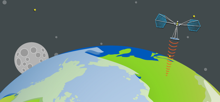
Our most fun — and perhaps strangest — graphic of 2014 (though #2 gives it a run for its money) might be our Space-Based Solar Power graphic. During Energy.gov’s Space Week, we dug into a far-out idea about harnessing solar power in space and beaming it down to Earth through lasers and microwaves. Sounds unlikely — but all of the technology already exists to make it a reality. Don’t believe us? Read more!
2) How Much Energy Do You Consume?
What’s the difference between a stick of dynamite and a burrito? One difference is that a burrito contains about five times more energy than a stick of dynamite. Unbelievable? Not at all. It’s a matter of how quickly you use that energy that makes the difference between an explosion and useable metabolic energy. In this graphic, we illustrate just how much energy someone like you consumes each year by comparing your consumption to things like burritos, dynamite and pounds of coal.
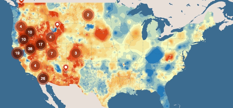
Before we built this map, we had a hard time knowing how current geothermal plants stacked up against areas of high geothermal potential. Now you can explore the contiguous United States and see where we have geothermal plants, and where we might in the future. Peruse the country at a high level of detail in this beautiful map.
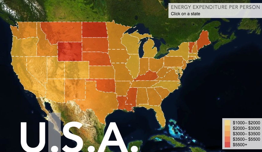
4) How Much Energy Do You Spend?
You and I spend a lot of money on energy each year. This amount has changed over the years and varies greatly from state to state. What role does transportation play in this? In this map, we delve into why your energy bill is as high as it is and dissect the numbers in a few interesting ways. Click on each state to see how much someone from that state has spent on energy for the last 40 years.
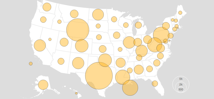
5) U.S. Energy Production Over the Last 20 Years
In the last few years, energy production in the U.S. has grown substantially. Increases in natural gas, crude oil and biofuels have led major growth in our nation’s energy portfolio. This map lets you explore each energy sector’s changes and growth over the last two decades.
View original version (ENERGY.gov): Top 5 Maps and Interactive Graphics of 2014
Tags: Daniel Wood, Interactive, United States Department of Energy, USDOE





 RSS Feed