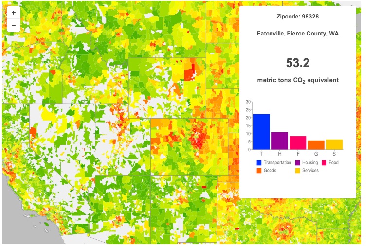
Keep an eye on your area’s carbon consumption and compare it to the rest of the country with these new interactive maps from UC Berkeley. Linked to their CoolClimate Carbon Footprint Calculator, this new tool visualizes the nation’s carbon consumption in a fresh way and invites new comparisons–pit the East Coast against the West, mountains again valleys or cities against suburbs. Additional maps break down carbon usage into household energy and transportation, so you can get a better idea of how that carbon is being burned.
Check the maps out here (coolclimate.berkeley.edu)
Tags: carbon footprint, CoolClimate, Interactive Map, UC Berkeley, University of California


 RSS Feed
I am employed the Hidalgo County Precinct 1 County Commissioner; as such we deal with residents
that live in rural areas. We have two significant problems that we should address before they
become major concerns for our citizenry: 1.) Our grid is overloaded sometimes with power outages,
2.) Rural ares do not have securiy lights to help deter crimes in neighborhoods.